All In To Vote
This case study was an interesting development, that used some assets I had made previously, combined with a new task.


Research and Development
Since I was going to be making GIFs, I wondered what were more popular GIFs that people were using. I came to the quick realization that every single GIF has one purpose, to be able to quickly portray a message while also being something that is worth adding onto whatever you'd be sharing with it.
I also got the amazing opportunity to talk with someone on the team, Bry Moore. In this meeting I learned more about what Civic Nation is expecting. Usually Civic Nation is a bit more serious, but their All In to Vote campaign is where they can have a bit more fun, and found that sometimes being off brand may be more surprising and engaging; a chance to bring more of a creative energy.
From there I developed 3 separate ideas and spoke to my art director about how to continue.
First Pass
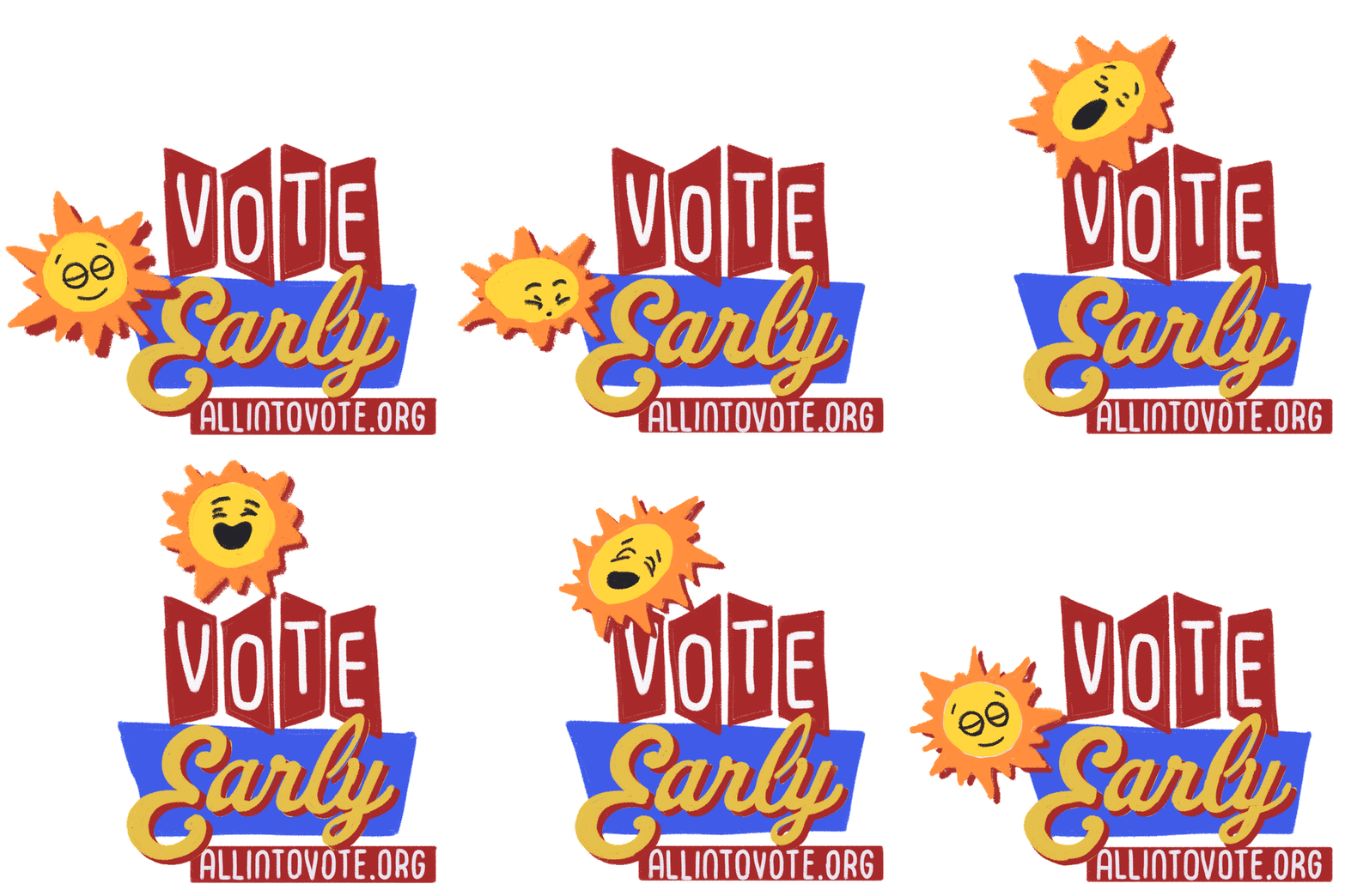
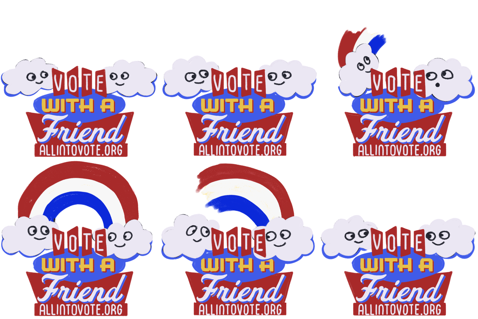
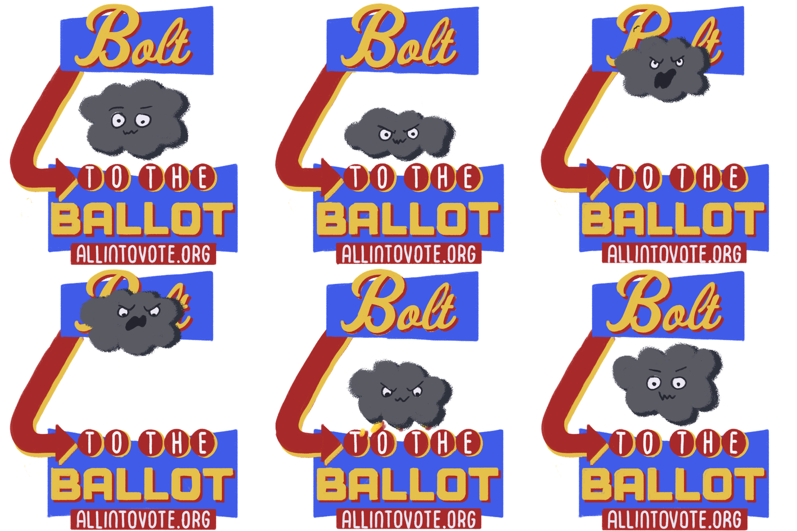
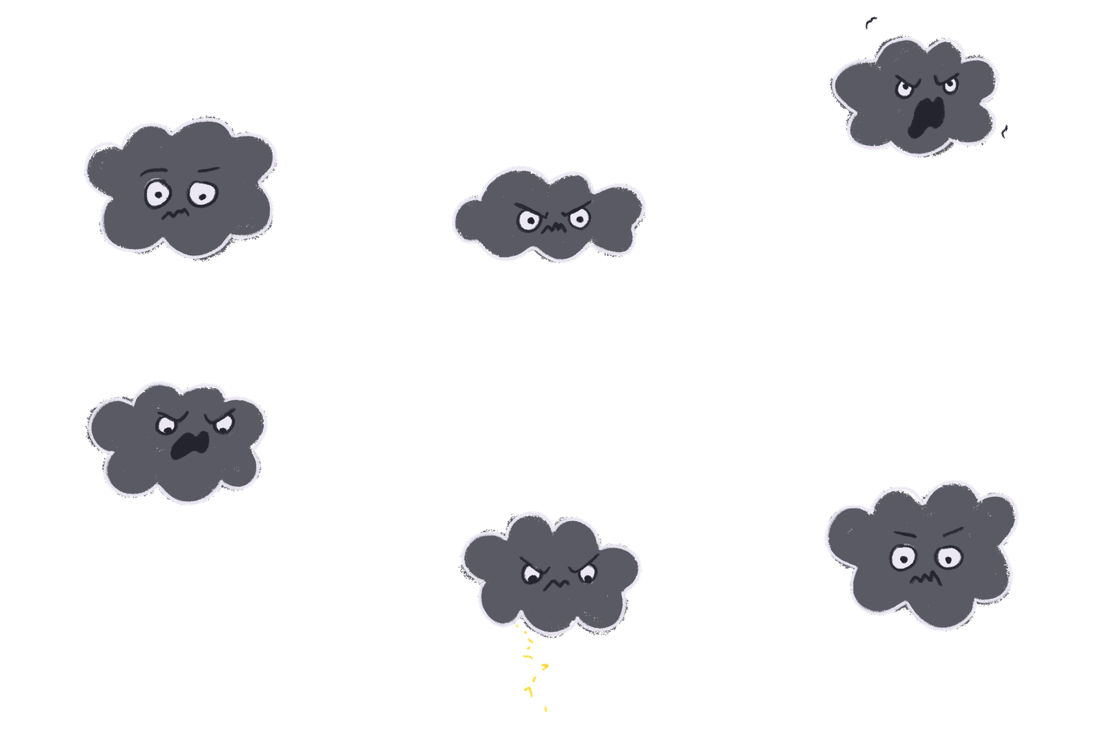
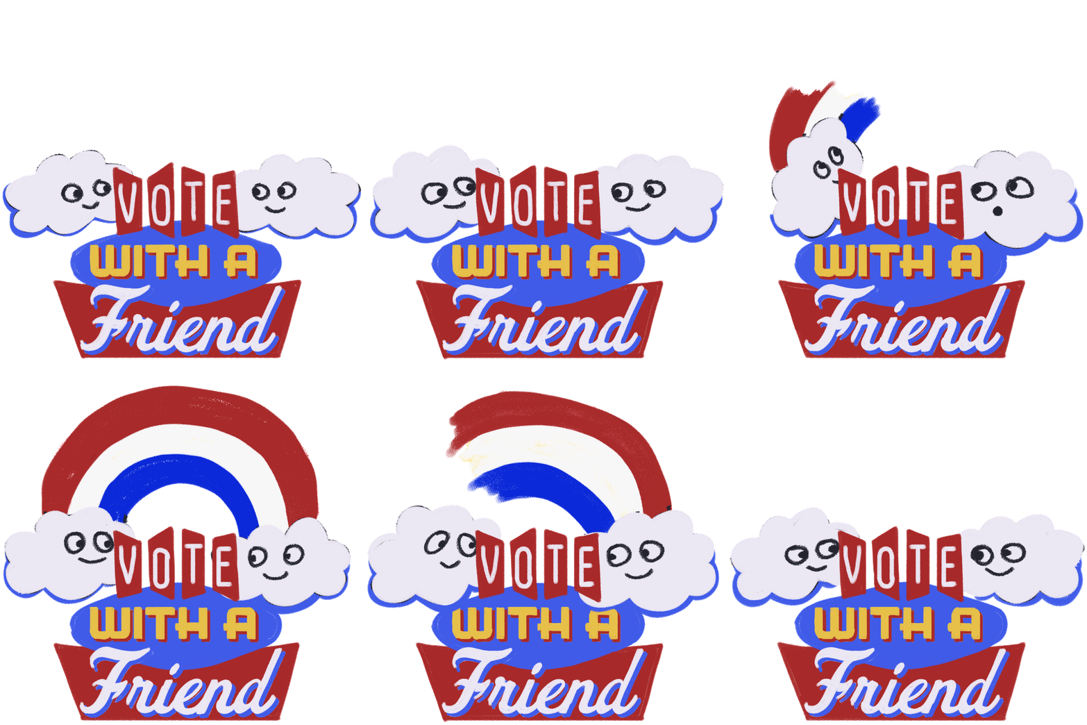
The idea that was chosen by the art director was using assets I had previously made, along with patriotic colors to bring a sense of playfulness and lightheartedness. Combining that with encouraging messages that would be relevant to voting, so these stickers could be reused no matter what year you see them.
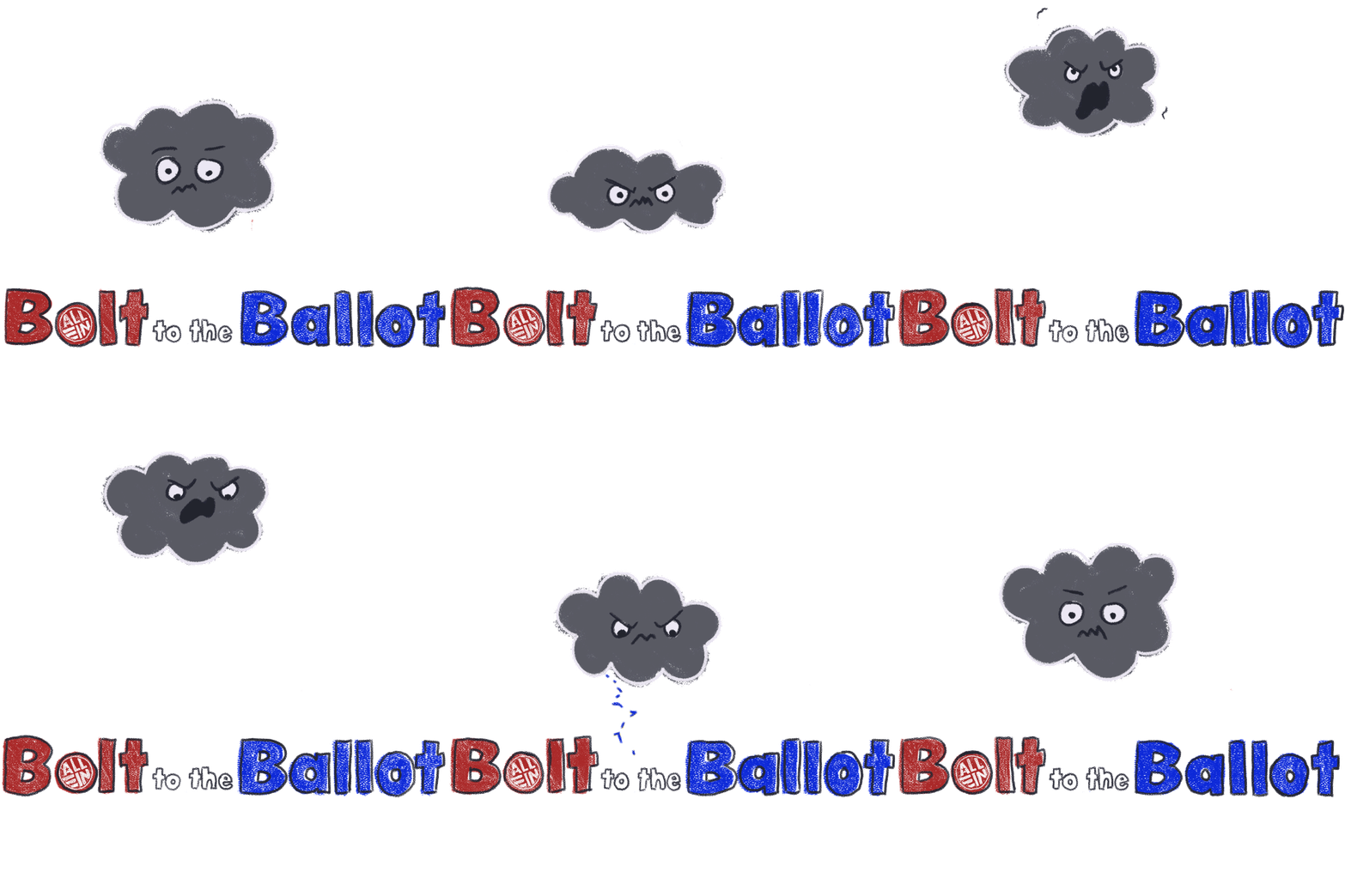

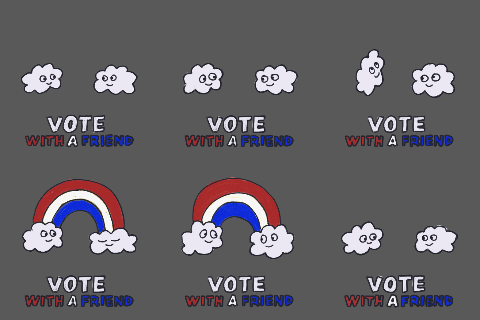
NOTES
-
Make sticker as large as possible, reaching the edges
-
Type does not feel incorporated into design and feels like a placeholder: try stacking and playing around with the layout
-
Make sure to have the font be playful too!
-
Design WITH the animation
Based on these notes, I knew that type was my biggest issue, and I had to figure out how to have more playful yet engaging and eye-catching type.
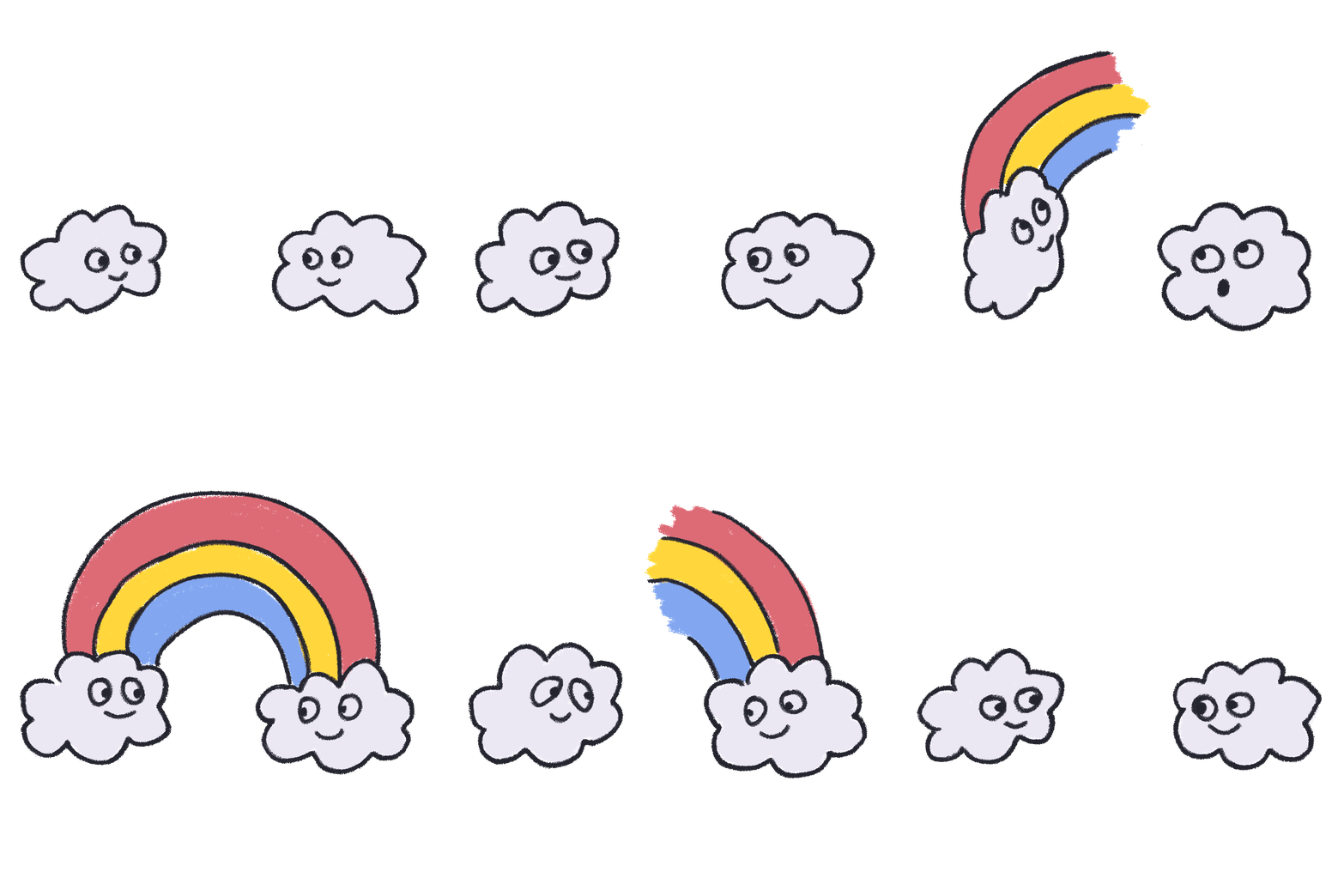
PAUSE...
When hurricane Idalia hit I took a beat to situate myself to the situation while keeping my GIFs slightly on the backburner. It worked out pretty well because I felt like I had a fresh set of eyes on my project.
Second Pass
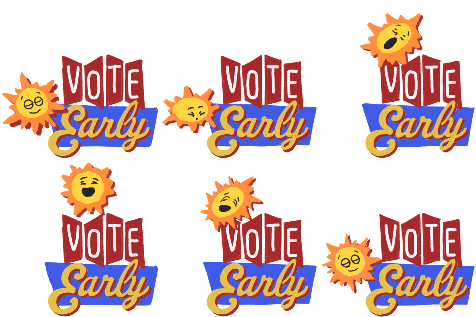
After my first pass I explored how the type could be more playful and how it could combine and interact with the animation that would be going along with it.
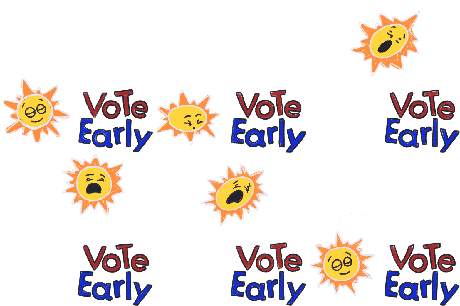
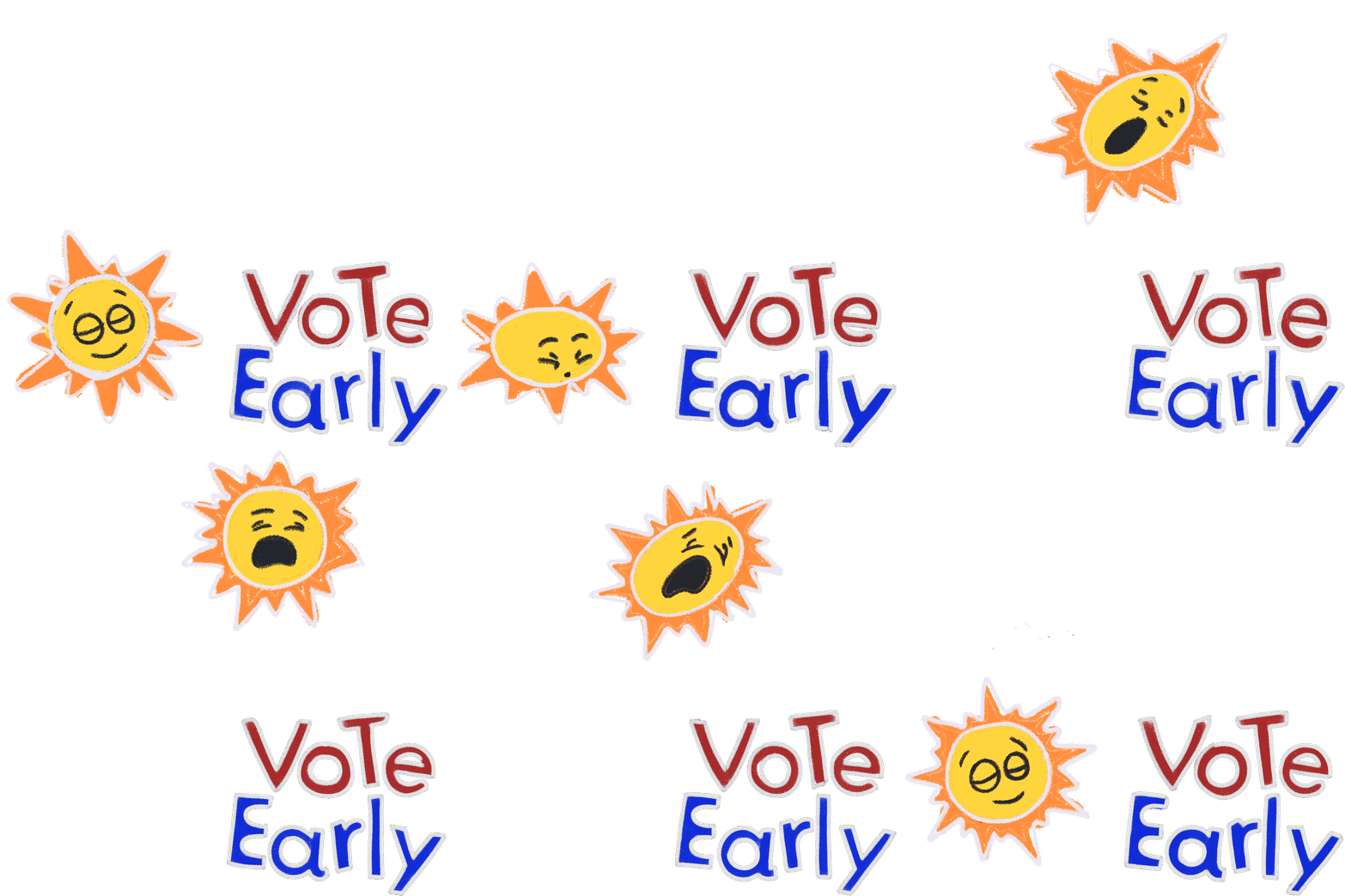
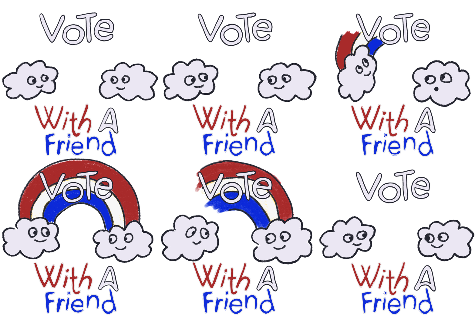
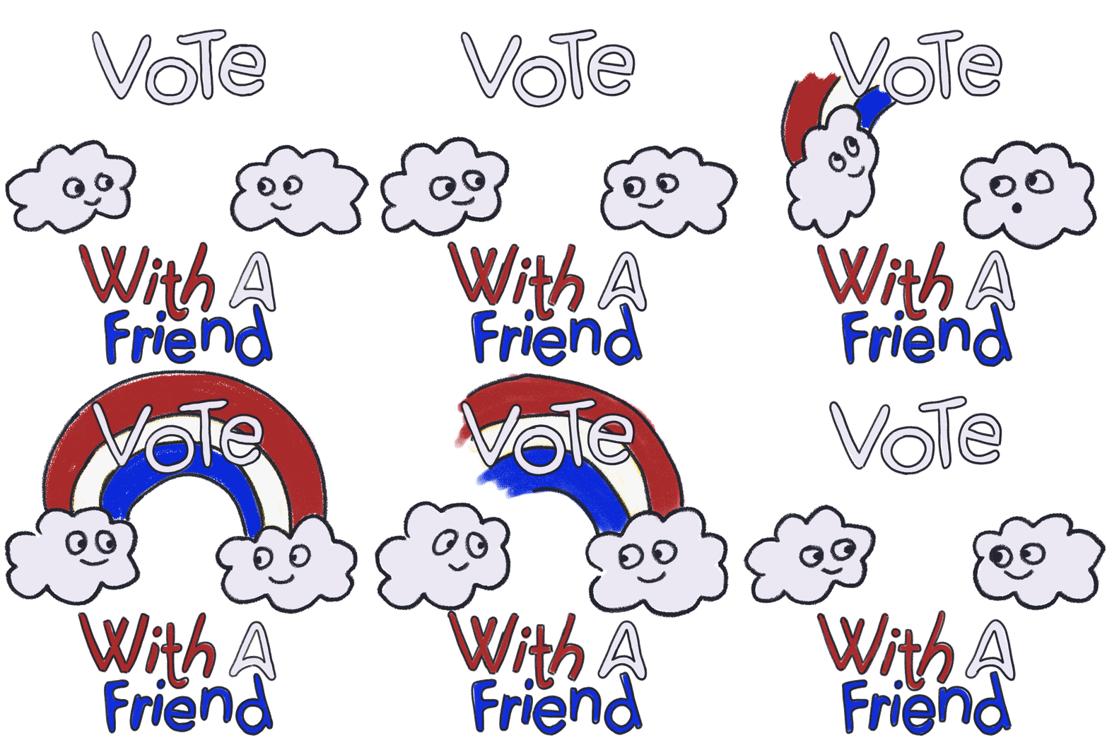
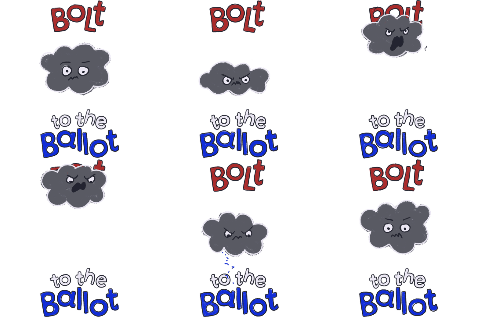
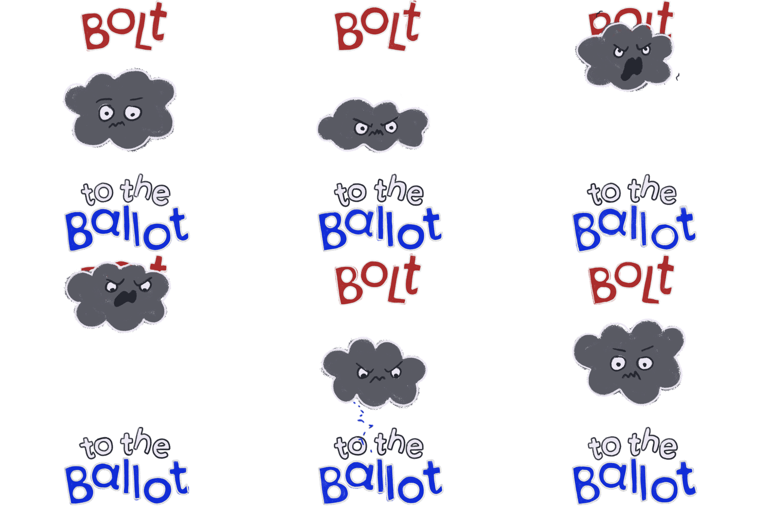
NOTES
-
Biggest issue is legibility! type is too thin too see or its not big enough.
-
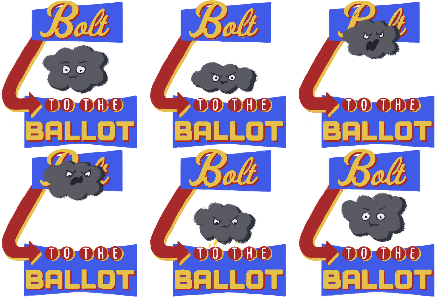
Use a previous concept that I had pitched, alluding to old motel/Vegas signs so it can have a frame behind the words.
-
Still can be fun but should also feel more refined and sophisticated.
-
The outlines on everything feel too childlike, try using shadows instead of outlines.
-
Faces of characters should still be positive overall.
Based on these notes I felt confident on where to go next and how to do so.
Mockups
Below are eamples on how these stickers could be used, showing how it is still legible and how it looks on top of other images.


FINAL PRODUCT
